CD Cover Research
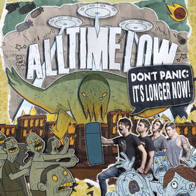
When looking at this All Time Low album cover, you can see it looks a lot more complicated than the other three albums. Although it looks like there is a lot going on, it is still a good album cover because it is interesting to look at and it also can be used to sell the artist because they are shown on the cover. This way the audience get a good idea of who the band are. The band logo is also shown on the cover. Although this is an interesting CD cover I will probably go for a more simple look with my CD cover.
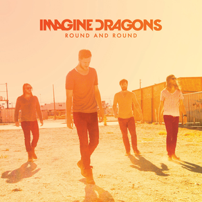
This Imagine Dragons album follows the You Me At Six album cover idea of using a simple image so that they don't over complicate the album cover. Instead of using a photo they have gone for more of an animated effect. This is something that looks effective but would be very difficult for us to achieve due to the software available. The idea of using one simple image is one I will probably use.
|
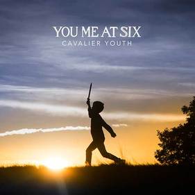
When looking at this You Me At Six cover, you can see that they have gone for a very simple look. The cover itself is just one image with some writing over the top. This looks good because they cover does not look overcomplicated. The one issue that there may be with the cover is that they are not using the CD cover as an advantage to tell the image of the band so that the audience know who they are. This may not be a problem though because people buying the album will have a good idea of who they are. I think that it is an eye catching image due to the sun setting in the background.
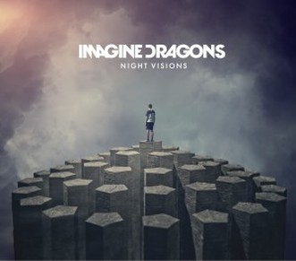
When looking at this Imagine Dragons CD cover, you can see that again they have gone for the simple idea of one image but this time they have used a photo instead of an animated image. This photo has a similar effect to the You Me At Six album cover due to the bright sun in the background but it looks as if they have used a bright filter for this image. This also shows the band so it sells the image of the band. I think that it would be good to use a similar image like this because it is simple but effective.
|
Magazine Advert Research
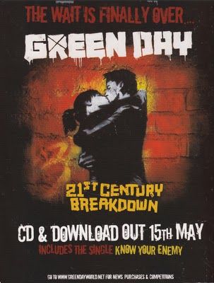
The Green Day '21st Century Breakdown" advert is a great example of an advert that is simply made up of the cover artwork from the album this is usually done as a marketing ploy as it means that people who see this add in the magazine will be able to recognize the album when they go to buy it from the shop, but it does also expand on the cover art by giving us the release date, featured songs and formats it can be purchased in. Here they are not using star power to sell the CD.
|

The Rihanna 'Loud' advert is a little different to the Green Day advert. This is because this advert uses a mixture of showing a picture of the artist and showing the CD cover. This way people who see this add in the magazine will be able to recognize the album when they go to buy it from the shop and the advert is also able to sell the artist even more by showing Rihanna again. You could say that they are trying to sell this album using star power, unlike the Green Day advert.
|
|
|
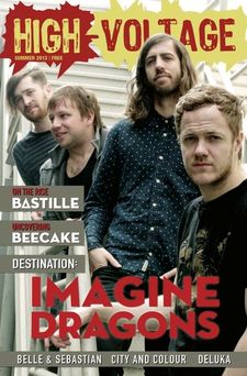
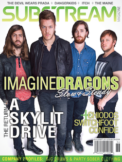
As you can see from the images above these are magazine articles about Imagine Dragons. There were not any magazine adverts of their CD cover. As you can see they have used a simple text for the name of the band and have placed that writing in front of an image of all four band members. Using an image of the band is a good way to sell the artist, this is so that the audience will get a good idea of who they are. The idea of using a simple image is something that I am aiming to do.
CD Design Plan
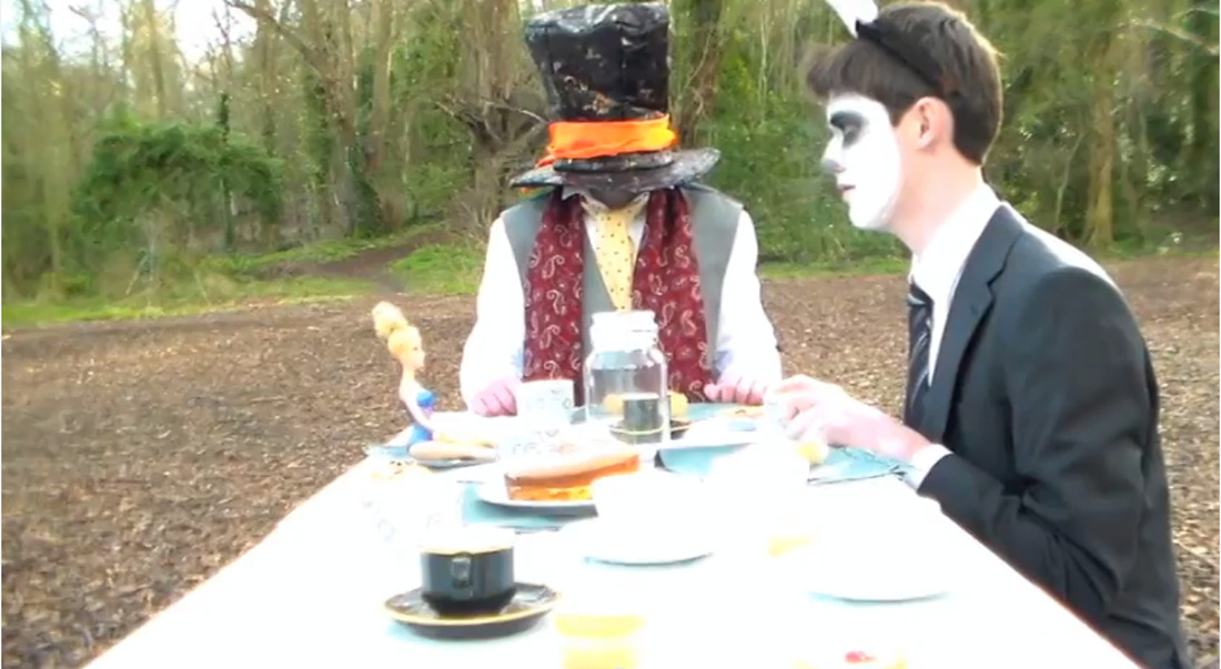
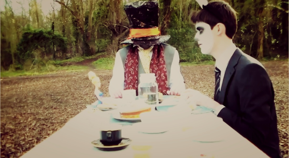
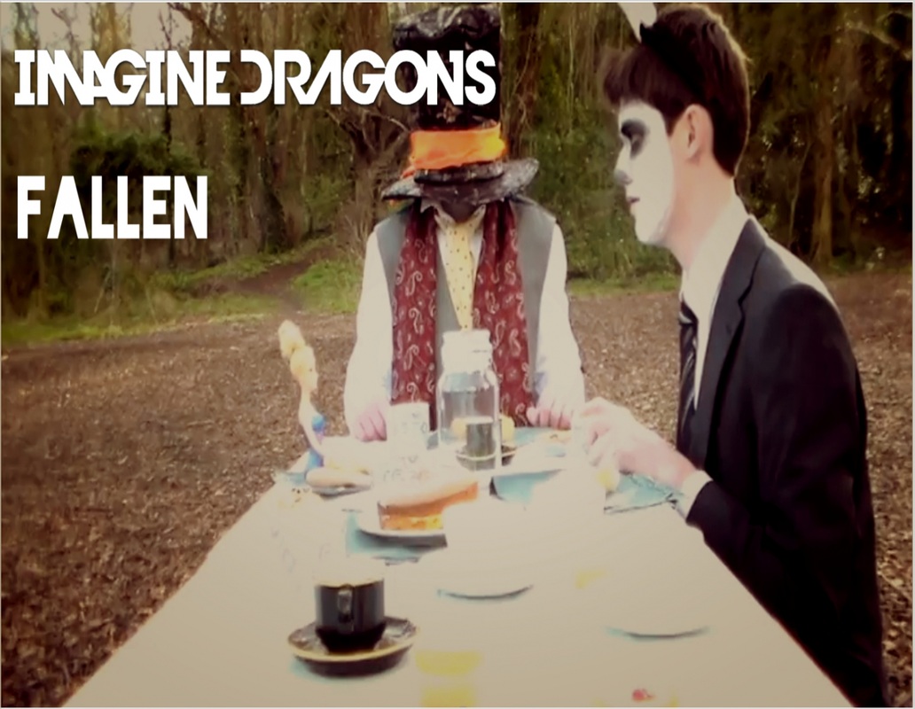
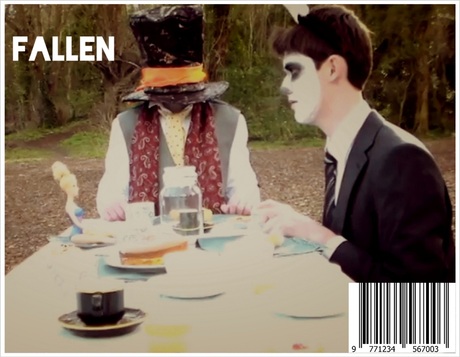
Here is my second design for my CD cover. Again for this design i have used an image from our music video. This was one of the later scenes from our music video when Alice is at the tea party with the rabbit and mad hatter. The real CD cover would look a little different because there would be a doll in the place of Alice because we used a doll. I feel like this is a simple design due to it being a shot from our music video. This follows the previous CD covers that the Imagine Dragons have because they go for a simple image that does not involve the band. I have done the same here.
|
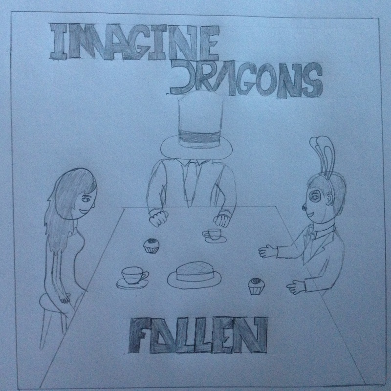
Here is my first design for my CD cover. For this design I have used an image from our music video. This is the very first scene in our music video when the playing cards rise from the ground. As you can see on the CD cover, Alice is laying on the floor in the woods as the playing cards are lifting from the ground. I feel like this is a simple design due to it being a shot from our music video. This follows the previous CD covers that the Imagine Dragons have because they go for a simple image that does not involve the band. I have done the same here.
|
CD and Back Design
|
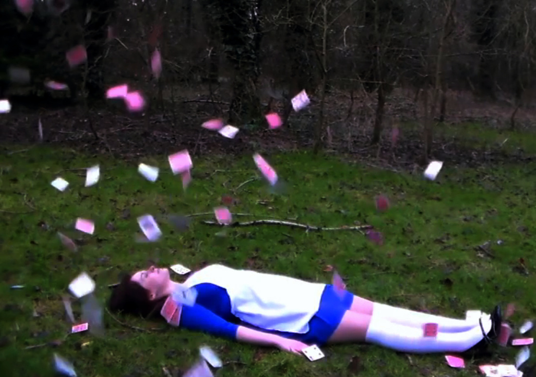
This is the original image that I took from our music video. This is one of the images that I want to use for my CD cover. I will need to add the band name and the name of the song. I may also change the filter of the image to make it look more appealing.
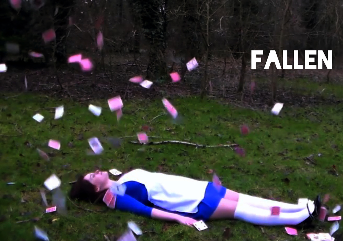
After changing the filter on the image I then added the name of the song. This was something that was quite hard to do because I had to try and find a font that looked similar to the Imagine Dragons font. The had not release Fallen as a single of the word 'Fallen' was not written in the same font. I chose to use the font 'Blackout' because it was the font that looked the most similar. After adding the name of the song I then needed to add the name of the Band.
|
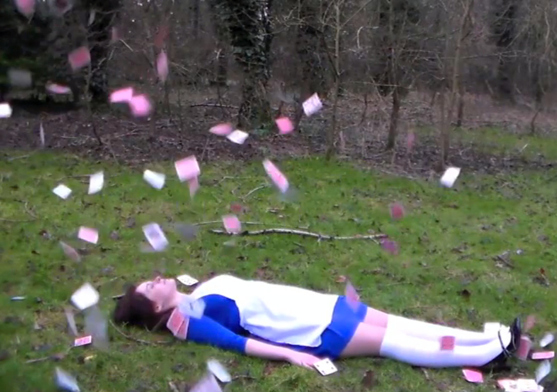
The first thing that I did to edit the image was change the filter. I thought that the imago looked a bit too bright, I was going to use white font on the image so I thought it would be better if I darkened the image. This is why I used a darker filter on my image. The next thing that I needed to do was add the name of the band and the name of the song.
|
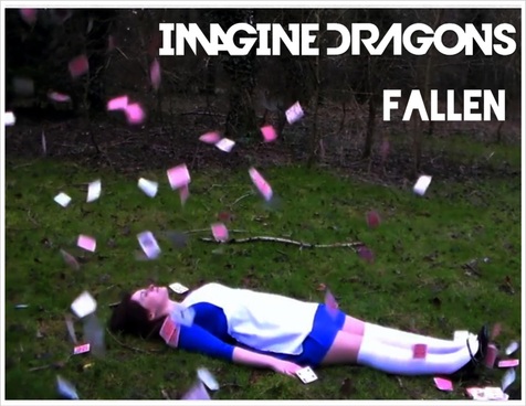
Here is the finished design for my CD cover. As you can see I used the idea of using an image from our actual music video. Here you can see the image of Alice with the playing cards falling upwards. I thought this would be a good shot to use because it is the first shot of our music video, it shows our main character and it follows what the Imagine Dragons do with not showing the band members. As you can see I have made changes to the image above. I added the name of the band onto the image and the name of the song. I also changed to filter of the image to give it a better look. I have now added everything I needed to. The next thing that I needed to do was to make the back of the CD cover.
As you can see here I have changed the filter on the image. This it to give the image a darker look so that the white font of the song will show up a lot better. The next things that I will have to do it to add the name of the song and add a barcode. 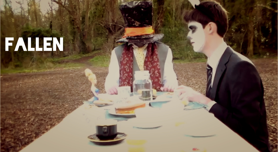
This was the original plan for the image. I was going to use this as another idea for a CD cover but thought that this would look better at the back of the CD. This way I would have used two of the better looking shots form our music video. |
This was the image that I was going to use for my second CD cover design but I thought I could use it as the back of my CD cover. Originally I was going to have the name of the song and the band name on this image because it was going to be the front of the CD. Instead it will need to have the name of the song and a barcode. With this image I will again apply a filter to make the image look more appealing.
I have now added the name of the song onto the image. One problem that I have realised with the image is that it is a bit too wide. This means that I will need to crop the image so that it will look better. After cropping the image I will then need to add the barcode.
|
Here is the final image of the back of the CD cover. As you can see I have changed the image from how it fist looked. I have changed the filter, the brightness and the contract of the image so that the white writing would stand out more. I also added the name of the song and the barcode onto the image. This makes it look a lot more professional and more like the back of a real CD cover.
Magazine Advert
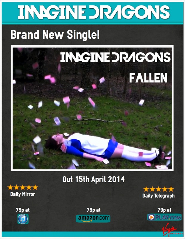
Here is my magazine advert for the CD. For this I used ideas that I got from some of the magazine adverts I looked at. I used to CD cover in the magazine advert so that the audience would know what the CD cover looks like. This is an idea I got from both the Green Day and Rihannah magazine adverts. With this advert you can clearly see the artists name, a clear image of the album cover, where you can buy it and how much it is, the reviews it has got and when it is going to be released. One of the only issues there may be with this magazine cover is that the band are not shown. A magazine advert is a good use of artist advertisement so this could be seen as a wasted opportunity to help sell the artist to the audience.
